 Mehek Kapoor
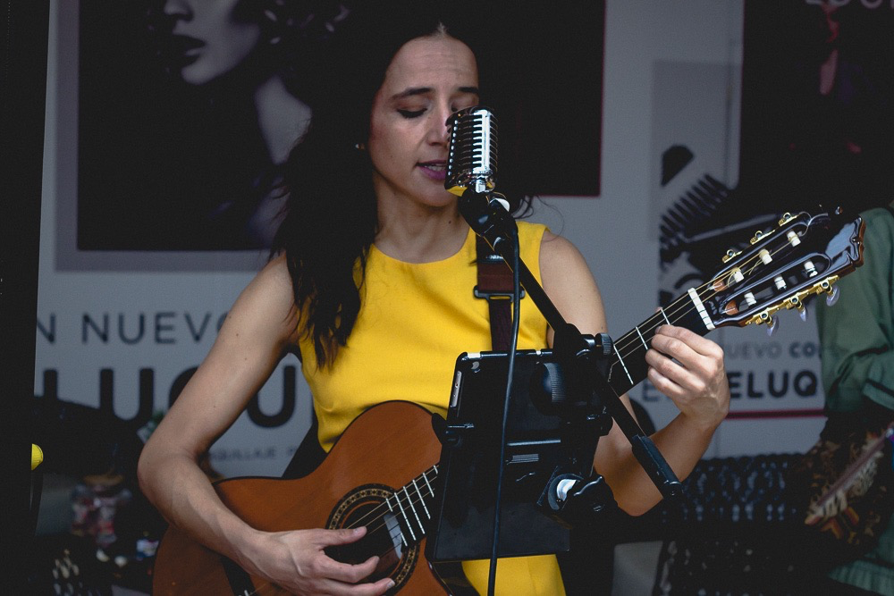
Finished tracking the Monsoon Sessions EP today. Still looking for a bassist for two of the five tracks.
The design system, generated from itself. Tokens come from
tokens.json; components are parsed out of
ml-core.css and ml-widgets.css. This page is styled
with those same files — if a component breaks, this page breaks.
Every mark in frontend/guide/brand/assets/, each shown on the
ground it was drawn for — detected from the file's own fills, so dropping a
new variant into the folder documents it. The wordmark set in Unica One
(.ml-wordmark) is the type treatment; these are the artwork.

favicon-mark.svgon ink · 2KB
logo-badge-inverse.svgon ink · 22KB
logo-dark-pill.svgon ink · 11KB
logo-lockup-black.svgon ink · 8KB
logo-lockup-grey.svgon ink · 8KB
logo-lockup-white.svgon ink · 9KB
logo-lockup-wide-caps.svgon ink · 7KB
logo-watermark-stacked.svgon ink · 12KB
mark-grey.svgon paper · 2KBWhere talent meets opportunity.
Clear, confident, creative, and professional. Avoid hype and generic marketplace language.
Which colour means what. A value alone does not say whether it is allowed on a primary button — this does, and it is the rule the old catalogue carried that the rebuild had not.
| Role | Token | Use |
|---|---|---|
| Brand | --color-pink | The brand signal. Intent, selection-in-progress, the one accent on a screen. |
| Primary | --color-ink | Every primary action and committed state. Black is the primary button, not pink. |
| Ground | --color-paper | Page ground. Chrome stays monochrome so media carries all saturation. |
The v4 rule also read “Purple = badges only.” There is no purple in
the palette and no component uses one, so that rule named a colour the
system does not have; badges use the status colours or
--color-ink. Recorded rather than dropped silently — a rule
that vanishes with no reason is how two colour books happened.
Colour moved into one book on 2026-08-30 — see Foundations → Colour below.
The brand-* tokens there are marketing-only, never a screen
colour; everything else is UI. Merged 2026-08-30: previously these lived
in a separate section up here, which is exactly the "two colour books"
problem the merge fixes.
Recovered from the old catalogue's Imagery section on 2026-08-31. Everything here is bound to a token or a component; nothing below introduces an asset the system does not already use. Media is the only element permitted to carry saturation — chrome stays monochrome, which is why these rules matter more than they look.
Three tokens. The old catalogue listed a
fourth — 3:2 · Studio Photo — and for studio photography it is
folded into --media-aspect-wide, whose description names studio
photos explicitly. A ratio differing from another by 0.28 is not a decision
anyone makes consistently at a glance.
One component still writes 3/2 literally:
.ml-dimension, the
Discover entry grid, where the ratio is load-bearing — six tiles in two
columns only resolve to a whole number of rows at 3:2. It is recorded here
rather than tokenised because the token budget is at its ceiling and a
fourth aspect used once would be a name for a single call site, which is the
sprawl the ceiling exists to stop. Found 2026-08-31 while measuring
contrast; this page had claimed the consolidation was total, and it was not.
--media-aspect-square
--media-aspect-wide
--media-aspect-cardOne treatment, not four. Any text laid over
artwork sits on --media-scrim — never on raw imagery, because
a photograph's luminance is not something the type can negotiate with.
Same photograph without the scrim would put white type over a blown highlight.
The old catalogue offered four overlay treatments. Only the dark gradient
survived, and the three that did not are recorded here rather than dropped
in silence. Pink Tint and Duotone both put chrome colour ON
the media, which inverts the one palette rule this system has — media
carries the saturation, chrome does not add any. Left Fade was a
layout need, not a treatment: a component wanting type beside artwork uses
.ml-split-editorial, which does not tint the photograph at all.
The old catalogue called these “Branded Media Assets” and listed them as a library to browse. They are not a library — each pool is already bound to a component, and that binding is the only reason a file here is part of the system. A pool with no component is not documented on this page.
| Pool | Folder | Files | Bound to |
|---|---|---|---|
object | img/5 — 3D object renders on transparent ground |
2 | c-bento |
motion | img/6 — Short looping animations |
1 | c-bento |
video | img/4 — Real motion, muted and looping |
3 | c-video c-split-editorial |

Counts are read from disk at build time, so adding a file to a folder makes
it available with no edit here — and build-hosting derives its
ship-list from the markup this produces, so a pool and what actually
deploys cannot drift.
Four steps, and the profile header is
--avatar-4. The old catalogue specified 96dp for
a profile and 64dp for a card; 96 is not a step and adding one
would break the four-step rule, so the profile header renders at 64 —
the value --avatar-4's own description already assigns to it.
--avatar-1
--avatar-2
--avatar-3
--avatar-4Black, grey and white build every surface and control.
One book. brand-* entries are marketing only, not the UI
palette — a screen never reaches for a brand* colour and a
poster never reaches for the UI palette; the separation is carried by the
name, not by a second group.
--color-ink#0D0D0DPrimary action AND primary text--color-paper#FCFCFDApp canvas / page background--color-white#FFFFFFCard and sheet fill--color-surface#F8F8FBSubtle raised/sunken fill — search bars, inactive segments, skeletons--color-line#D5D5DEHairline borders, dividers, list separators--color-muted#66666FSecondary text, metadata, placeholder--color-pink#EA4C89Brand accent — focus ring, selection, active tab, brand mark, waveform progress--color-pink-pressed#C7295FTwo jobs, one token--color-pink-container#FCE7F3The one permitted tinted surface — accent chips, progress tracks--color-ink-pressed#2B2B2BPressed state of a primary (black) control — lifts off pure black so the press is visible--color-success#22C55E--color-warning#F59E0B--color-error#DC2626--color-brand-warm-pink#FF005CBrand pink--color-brand-black#141621Brand black, faintly blue--color-brand-white#FFFFFFThe supplied swatch labelled White carried HEX #000000 against RGB 255 255 255 — contradictory--color-brand-dark-gray#4F5059EXPRESSION ONLY — never on a product screen--color-brand-light-gray#C4C5C8EXPRESSION ONLY — never on a product screen--color-info#2563EBInformational badge — 'On Tour', 'Remote available'--color-disabled#9CA3AFInactive control borders and text--color-scrimrgba(13,13,13,0.32)Backdrop behind drawers, sheets and modals--color-purple#8B5CF6BADGES ONLYFour steps each, exponential — every scale except type, which moved to seven on 2026-09-11 when the brand owner lifted the cap. Every step is visibly different from its neighbour; that is still the point.
| 1 | 2 | 3 | 4 | |
|---|---|---|---|---|
| space | 4px | 8px | 16px | 32px |
| radius | 8px | 16px | 32px | 9999px |
| size | 32px | 40px | 48px | 56px |
| icon | 16px | 20px | 24px | 32px |
| avatar | 24px | 32px | 48px | 64px |
| elevation | 1.dp | 3.dp | 8.dp | 12.dp |
| opacity | 0.08 | 0.16 | 0.32 | 0.64 |
| motion · web | 125ms | 200ms | 320ms | 500ms |
| motion · android | spring 1/1500 | spring 0.9/700 | spring 0.85/400 | spring 0.75/300 |
Grown from four on 2026-09-11: 14px and 28px fill the two gaps the old 12/16/22/32 ramp left, and 40px is the hero step used once, on the pre-auth landing.
| 1 | 2 | 3 | 4 | 5 | 6 | 7 | |
|---|---|---|---|---|---|---|---|
| type · web | 12px–13px | 14px–15px | 16px–18px | 22px–28px | 28px–36px | 32px–44px | 40px–56px |
| type · android | 12sp | 14sp | 16sp | 22sp | 28sp | 32sp | 40sp |
| type · iOS | caption1 | subheadline | body | title3 | title | largeTitle | largeTitle |
Type and motion are dual-authored: clamp() does not exist on
native and native motion is spring physics, so a single web value could never
be handed to a Compose engineer. Web clamp minimums equal the Android
sp values, so this preview shows what the app will render.
Measured, not asserted. A step passes if each neighbour differs by at least 1.5× — roughly where a difference stops being arguable at a glance.
| Scale | Steps | Ratios | Verdict |
|---|---|---|---|
| space | 4/8/16/32 | 2.0x, 2.0x, 2.0x. 8x spread. | Pass |
| radius | 8/16/32 | 2.0x, 2.0x. Step 4 (9999) is functional, not a scale step. | Pass |
| opacity | 0.08/0.16/0.32/0.64 | 2.0x, 2.0x, 2.0x. 8x spread. | Pass |
| motion | 125/200/320/500ms | 1.6x, 1.6x, 1.56x. 4x spread. | Pass |
| zIndex | 100/200/400/800 | 2.0x, 2.0x, 2.0x. | Pass |
| elevation | blur 3/12/24/32 | clearly separable at every step. | Pass |
| size | 32/40/48/56 | 1.25x, 1.2x, 1.17x. Constant set, not a scale — Material's 48dp / iOS's 44pt touch-target floor rules out an exponential ramp here. | |
| type | 12/14/16/22/28/32/40 | 1.17x, 1.14x, 1.38x, 1.27x, 1.14x, 1.25x. Seven steps since 2026-09-11: 14 and 28 fill the two gaps the original 12/16/22/32 perfect-fourth ramp left, and 40 is the hero. Chosen for text, not a strict exponential scale. | |
Every axis of every step, and the Compose TextStyle it
becomes. Generated from the same source the CSS is, so the app and this page cannot disagree.
| Token | Fluid value (web) | Weight | Compose TextStyle | Usage |
|---|---|---|---|---|
| --type-1 | 12px → 13px | 600 | TextStyle(fontFamily = Inter, fontSize = 12sp, lineHeight = 16sp, fontWeight = FontWeight.W600) |
Micro labels, captions, badges, metadata, timestamps |
| --type-2 | 14px → 15px | 400 | TextStyle(fontFamily = Inter, fontSize = 14sp, lineHeight = 20sp, fontWeight = FontWeight.W400) |
Secondary body — supporting lines under a title, list-item metadata, form help. Added 2026-09-11: nothing sat within 2px of 14, so screens carried 14–15px as arbitrary sizes |
| --type-3 | 16px → 18px | 400 | TextStyle(fontFamily = Inter, fontSize = 16sp, lineHeight = 24sp, fontWeight = FontWeight.W400) |
Body copy, default UI text, list item titles |
| --type-4 | 22px → 28px | 600 | TextStyle(fontFamily = InterTight, fontSize = 22sp, lineHeight = 28sp, fontWeight = FontWeight.W600) |
Section headings, card titles, screen titles |
| --type-5 | 28px → 36px | 600 | TextStyle(fontFamily = InterTight, fontSize = 28sp, lineHeight = 36sp, fontWeight = FontWeight.W600) |
Large titles — a detail screen's headline, a figure inside a card. Added 2026-09-11 to fill the 22→32 gap, the widest in the old ramp |
| --type-6 | 32px → 44px | 800 | TextStyle(fontFamily = InterTight, fontSize = 32sp, lineHeight = 40sp, fontWeight = FontWeight.W800) |
Display — now-playing track title, the one big number on a screen |
| --type-7 | 40px → 56px | 800 | TextStyle(fontFamily = InterTight, fontSize = 40sp, lineHeight = 48sp, fontWeight = FontWeight.W800) |
Hero — the pre-auth landing headline only, one per product. Added 2026-09-11; the Lovable app shipped it first as its own --type-5. On iOS it maps to largeTitle, the largest Dynamic Type style |
| Property | Value | Usage |
|---|---|---|
| Paragraph spacing | var(--space-3) · 16px | Between paragraphs |
| Max line width | var(--layout-measure) · 64ch | Readable prose width — .ml-measure |
| Font fallback | -apple-system, BlinkMacSystemFont, sans-serif | Declared inside each --font-* value |
| Number style | Tabular | Stats, tables, timers — .ml-tabular |
Component dimensions from the spec. Where a value already lands on a scale it is mapped, not duplicated — emitting it again would be a second name for the same number, which is how the previous system reached 248 tokens.
| Component | Resolves to | Value |
|---|---|---|
--comp-btn-h-sm / -md / -lg | --size-1 / --size-2 / --size-3 (32 / 40 / 48) | |
--comp-input-h | --size-2 (40) | |
--comp-chip-h | --size-1 (32) | |
FAB small / regular | --size-2 / --size-4 (40 / 56) | |
Touch target min / comfortable | --size-3 / --size-4 (48 / 56) | |
Nav height | --size-3 (48) | |
Switch track height | --size-1 (32); width is --component-switch-track (52) | |
--comp-card-padding / -radius | --space-3 / --radius-3 (16 / 32) | |
--layout-gutter-mobile / -tablet / -desktop | --space-3 / --space-4 / --space-4 (16 / 32 / 32) | |
--layout-gap-sm / -md / -lg | --space-2 / --space-3 / --space-4 (8 / 16 / 32) | |
--layout-aspect-card / -hero / -avatar | 4/3 has no token (see meta.knownGaps); --media-aspect-wide 16/9; --media-aspect-square 1/1 | |
--state-disabled-opacity | --opacity-3 (0.32) | |
--state-hover-bg | --color-ink at --opacity-1 | |
--state-pressed-bg | --color-ink at --opacity-2 | |
--state-selected-bg | --color-pink-container | |
--state-focus-ring | 2px --color-pink at 2px offset — one definition, in ml-core.css :focus-visible | |
--int-app-touch-target-min / -comfortable | --size-3 / --size-4 | |
--int-web-hover-transition | --duration-2 (200ms), aliased as --gesture-hover-transition because the spec names it | |
--sp-xs / -sm / -md / -lg / -xl / -2xl | --space-1 / -2 / -3 / -4; 24 and 48 have NO token by design — they are the midpoints an exponential scale deliberately omits | |
--r-card / -media / -pill / -avatar | --radius-3 (32, spec said 24 — changed to match the scale) / --radius-2 / --radius-4 / --radius-4 | |
Paragraph spacing | --space-3 (16) | |
Font fallback | declared inside each --font-* value, not a separate token | |
Tabular numbers | a utility class .ml-tabular, not a token — it is a font-feature-settings switch, not a value | |
| Token | Shadow | Usage |
|---|---|---|
| --elevation-1 |
0 1px 3px rgba(13,11,38,0.08) |
Cards, chips, resting surfaces. Prefer a --color-line border before reaching for this. |
| --elevation-2 |
0 4px 12px rgba(13,11,38,0.05) |
Hover cards, dropdowns, popovers |
| --elevation-3 |
0 8px 24px rgba(13,11,38,0.08) |
FAB, side sheet, bottom sheet, mini-player |
| --elevation-4 |
0 12px 32px rgba(13,11,38,0.12) |
Modals, dialogs, full-screen overlays |
| --border-1 | 1px solid var(--color-line) | Divider, card border, input rest |
| --border-2 | 2px solid var(--color-pink) | Focus ring, selected card or chip |
| disabled border | 1px solid var(--color-disabled) | Inactive controls |
| State | Trigger | Visual |
|---|---|---|
| Default | Rest | Base style |
| Hover | Pointer enter | --elevation-2, translateY(-2px). Pointer only — no hover on touch. |
| Focused | Keyboard / Tab | 2px var(--color-pink) outline at 2px offset |
| Pressed | Pointer down | scale(0.96–0.97), var(--duration-1) |
| Selected | Tap / click | var(--color-ink) fill for commitment; var(--color-pink-container) for intent |
| Disabled | Inactive | opacity var(--opacity-3) · 0.32, pointer-events none |
| Loading | Async | .ml-skeleton shimmer |
| Error | Validation fail | var(--color-error) border and message |
| Empty | No data | .ml-empty — icon, message, CTA |
Which foundation colour fills which role. These emit no CSS of their own — on web you use the foundation token directly, because a role alias would be a second name for the same value. The role names exist for the Compose and SwiftUI exports.
| Role | Token | Usage |
|---|---|---|
| Primary | --color-ink | CTAs. Black, not pink — set by the brand owner. |
| Accent | --color-pink | Focus, selection, active tab, brand mark. Never a CTA fill. |
| Primary container | --color-pink-container | Badge and tag ground |
| Surface | --color-white | Card and sheet fill |
| Surface variant | --color-surface | Search bars, inactive segments, skeletons |
| Background | --color-paper | App canvas |
| Outline | --color-line | Hairlines and dividers |
| Success | --color-success | Confirmed, available, verified |
| Warning | --color-warning | Pending, caution |
| Error | --color-error | Rejected, critical, destructive |
| Info | --color-info | On Tour, remote available |
| Disabled | --color-disabled | Inactive elements |
| Scrim | --color-scrim | Backdrop behind drawers, sheets, modals |
The four real icon tokens. 16 and 24 are the two drawn grids;
20 and 32 are scaled, which is why every icon carries a viewBox — without one,
resizing crops the path instead of scaling it. (Intermediate sizes like 14/18/22 showed here
until 2026-08-30 — they weren't tokens, just components that hadn't been snapped to the scale yet.)
The launcher mark at the sizes Android and iOS ask for, each on the ground it is drawn for. Picking the variant by ground rather than by taste is the whole rule.
Meet WCAG AA contrast, support screen readers and keyboard/focus navigation, preserve clear focus states, and never communicate critical meaning through colour alone.
Reconciled 2026-08-31. This file predates the v9 system and several of its values had gone stale. Corrections are marked below; the rules that survived are unchanged. It is now rendered into /guide by scripts/build-guide.mjs, so this file is the source and cannot drift from the catalogue again.
| Rule | Value |
|---|---|
| Touch target | --size-3 (48dp) web + Compose, 44pt iOS |
| Contrast, normal text | 4.5:1 |
| Contrast, large text | 3:1 |
| Focus ring | 2px --color-pink at 2px offset, :focus-visible only |
Was “keep targets at least 44px” without qualification. 44 is the Apple floor; web and Android are 48. Both now ship, per platform, from one token source.
--media-scrim, never on raw imagery.Spec items that were considered and deliberately NOT adopted, or moved out of CSS entirely. Moved here from Gaps on 2026-08-31: none of these is outstanding work, and listing a settled decision under "Gaps" reads as a backlog item nobody has got to. A gap is something missing; this is something decided.
| Item | Why |
|---|---|
| breakpoints 767/1023/1440 — decision, not a gap | The spec's four breakpoints were considered and NOT adopted, not overlooked. platform.windowSize keeps Material's 600/840 WindowSizeClass values because those are what Compose actually branches on, and the app is Android-first. Shipping web breakpoints that disagree with the native ones is the exact drift v9 removed. --layout-max 1440 is kept as a max-width, which is what the spec's 1440 figure really was. |
| density modes | Not implemented, as the spec itself notes. |
| Snackbar 4s/10s | Durations are behaviour, not design tokens — they belong to the toast controller, not the stylesheet. Documented in the toast section's prose instead. |
The app draws edge to edge — content renders behind the status and navigation bars, and the bars themselves stay transparent. Nothing may rely on the OS reserving that space, so every fixed-position component pads itself by an inset token. Recovered from the old catalogue's Android Platform section on 2026-08-31; the tokens already existed but nothing on this page said what they were for, which is how three of them ended up referenced by no component at all.
| Token | Value | Compose inset | What it is |
|---|---|---|---|
--safe-top | env(safe-area-inset-top, 24px) |
WindowInsets.statusBars | Status bar. The fallback is the 24dp Android status bar, used when env() is unsupported. |
--safe-bottom | env(safe-area-inset-bottom, 16px) |
WindowInsets.navigationBars | Gesture bar / navigation bar. |
--chrome-status-bar | 24px |
WindowInsets.statusBars | Status-bar height as a plain number, for layout maths that cannot use env(). |
--chrome-nav-bar | 48px |
WindowInsets.navigationBars | Three-button navigation bar height. |
--chrome-scrollbar | 12px |
— | Desktop scrollbar width. Web-only; there is no native counterpart. |
Applied by .ml-appbar (padding-top: calc(var(--space-2) +
var(--safe-top))), .ml-tabbar and the floating action
button, so a screen author never adds inset padding by hand. The old
catalogue also listed WindowInsets.ime,
systemGestures and displayCutout: IME is a
component here (see native keyboard &
IME), and the other two are behaviour Compose handles, not values a
stylesheet can hold.
Approved components are shared primitives, controls, and composable blocks. Create an implementation and a usage specification together.
Reconciled 2026-08-31. This file predates the v9 system and several of its values had gone stale. Corrections are marked below; the rules that survived are unchanged. It is now rendered into /guide by scripts/build-guide.mjs, so this file is the source and cannot drift from the catalogue again.
--radius-3 (32px) corner, --border-1 solid --color-line, --color-paper background. Was “24dp radius, 1px #ECECF1” — #ECECF1 is exactly --color-line, but 24dp is not a step on the radius scale (8/16/32/pill), so it could never have been built from tokens.--radius-4), minimum --size-3 (48dp) in both axes. Was “min 44px”. 44pt is the Apple floor and is correct in MusicLinkdTokens.swift; the web and Compose floor is Material's 48dp. Controls smaller than that carry an invisible 48dp target — see .ml-hit.The ten below were the original core. The system now documents 133 sections across ml-core.css and ml-widgets.css; /guide is the live list and this table is kept as the historical minimum, not the ceiling.
| Component | Purpose |
|---|---|
| Button (primary, secondary, ghost) | CTAs, actions, passive triggers |
| Input Field | Form fields, onboarding, credentials, messaging |
| Chip | Genre/role/filter selectors (pill, toggle) |
| Search Bar | Directory search with category filters |
| Bottom Navigation | Master app tab switching |
| Audio Player / Waveform | Playable audio moments with animated waveform |
| Bottom Sheet | Modal overlay for confirmations, filters, forms |
| Empty State | Universal template for empty lists and no results |
| Verification Badge | Trust signal for verified artists and studios |
| Status Badge | Availability, confirmation, urgency indicators |
[hidden] must win. The UA stylesheet's `[hidden] { display: none }` has the lowest possible specificity, so ANY author display rule beats it — and this system sets display on nearly every component (.ml-btn is inline-flex, .ml-otp is flex). Without this, app-shell.js's state switching sets the attribute correctly and…
Document defaults, the focus ring, the reduced-motion guard and the
[hidden] override. Not a component — no demo.
Not used by any screen yet. Built and documented here; no flow has recycled it.
.ml-hitRecycled on 168 screens
across 24 flows —
auth/email_auth, auth/email_verification, auth/forgot_password, auth/google_signin, auth/mobile_auth, auth/otp_verification and 162 more.
.ml-btn .ml-btn--primary .ml-btn--secondary .ml-btn--accent .ml-btn--ghost .ml-btn--block .ml-btn--lg .ml-btn--smRecycled on 190 screens
across 24 flows —
auth/email_auth, auth/email_verification, auth/forgot_password, auth/google_signin, auth/mobile_auth, auth/otp_verification and 184 more.
.ml-icon-btn .ml-icon-btn--bare .ml-icon-btn--primary .ml-icon-btn--mutedRecycled on 53 screens
across 18 flows —
auth/email_auth, auth/forgot_password, auth/mobile_auth, auth/reset_password, band/band_create, band/band_settings and 47 more.
.ml-fieldPill, leading glyph, optional trailing voice affordance.
Recycled on 3 screens
across 2 flows —
discover/discover_feed, discover/global_search, portfolio/add_collaborators.
.ml-search .ml-search__icon .ml-search__dividerA chip is a CONTROL (filter, selection). For a read-only state label use .ml-status below — conflating the two is why screens grew both a .chip and a .status-pill that looked alike but behaved differently.
Press one — pressed is pink (intent), selected is ink (commitment).
Recycled on 40 screens
across 11 flows —
booking/configure_session, booking/filters, discover/advanced_filters, discover/businesses, discover/communities, discover/discover_opportunities and 34 more.
.ml-chip .ml-chip__icon .ml-chip__dismissRead-only state label. The container and text colours are DERIVED from the three status tokens with color-mix, so adding "available / pending / live" costs zero new tokens — screens were hardcoding #DCFCE7/#166534 pairs (89 off-palette hex values across the app) purely because these did not exist.
Recycled on 72 screens
across 22 flows —
auth/registration_write, band/band_create, band/band_profile_layout, band/band_settings, band/ensemble_lineup, band/upcoming_shows and 66 more.
.ml-status .ml-status--neutral .ml-status--success .ml-status--warning .ml-status--error .ml-status--accent .ml-status--infoCATEGORY, not state. Purple is scoped to this one modifier by the palette rule "Pink=Brand. Black=Primary. Purple=Badges only" — reinstated 2026-08-31. A category badge says what KIND of thing this is (genre, service, role); the status colours say how it is GOING. Those were being conflated, which is why genre labels…
Purple is category, never state — a genre or service kind, not how something is going. It is scoped to this one modifier and appears nowhere else in the system.
Recycled on 3 screens
across 3 flows —
discover/studios_spaces, home/home_dashboard, portfolio/add_collaborators.
.ml-badge .ml-badge--accent .ml-badge--category .ml-badge--overlay .ml-badge--removable .ml-badge__removeA hairline border is the default separator. Elevation is opt-in, because a flat monochrome system separates by contrast, not by stacked shadows — which is why the elevation scale is 2 levels rather than 4.
Hairline border by default; elevation is opt-in.
Recycled on 15 screens
across 4 flows —
discover/discover_opportunities, discover/discover_profile_detail, discover/project_detail, discover/projects, discover/service_detail, discover/studio_profile_discover and 9 more.
.ml-card .ml-card--inset .ml-card--flat .ml-card--lg .ml-card--padded .ml-card--raisedThe one element allowed to carry saturation. Any text laid over artwork MUST sit on the scrim, never on raw imagery.
Recycled on 4 screens
across 2 flows —
discover/projects, discover/studios_spaces, portfolio/media_preview, portfolio/portfolio_dashboard.
.ml-media .ml-media--square .ml-media--wide .ml-media--scrim .ml-media__overlay .ml-media__tag .ml-media__actReplaces the 14 broken var(--r-avatar) references: an avatar is radius-4.
Recycled on 30 screens
across 13 flows —
auth/google_signin, booking/studio_profile, business_profiles/business_reviews_gallery_tab, communication/chat_conversation, communication/networking_feed_artist_profile, discover/business_profile and 24 more.
.ml-avatar .ml-avatar--sm .ml-avatar--lg .ml-avatar-btn"Featured talent … See all" + a horizontally scrolling row. The single most repeated layout in the app and in the reference build.
Recycled on 102 screens
across 23 flows —
band/band_create, band/band_profile_layout, band/band_settings, band/ensemble_lineup, booking/configure_session, booking/equipment_screen and 96 more.
.ml-section .ml-section__link .ml-railRecycled on 10 screens
across 4 flows —
discover/service_detail, onboarding/instrument_proficiency, onboarding/review_confirm, portfolio/credit_attribution, portfolio/profile_project_view, portfolio/publish_project and 4 more.
.ml-row .ml-row__body .ml-row__title .ml-row__metaRecycled on 1 screen
across 1 flow —
auth/welcome.
.ml-divider .ml-divider--labelledSkeletons, not spinners, for content — a spinner tells the user nothing about what is arriving. tokens.json v8 recorded state.loading as "no dedicated token"; this is that gap closed.
Recycled on 19 screens
across 11 flows —
home/home_dashboard, notifications/notifications_center, auth/email_auth, auth/email_verification, auth/otp_verification, auth/splash and 13 more.
.ml-skeleton .ml-spinnerThis section used to SET the brand in type — Inter Tight 800 with a pink "d" — which is not the logo. The logo is drawn artwork and lives in brand/assets as nine variants. A typographic stand-in beside a real mark guarantees the two drift, so the mark is now an <img> of the real file and the type is only the fallback…
Eight of the nine files are white artwork and only mark-grey is drawn dark, so
paper gets the mark and ink gets the lockups. Putting a white lockup on paper is not a
styling slip — the wordmark simply disappears, which is what this demo used to do.
Type fallback — never beside the real mark.
Recycled on 9 screens
across 7 flows —
auth/splash, auth/welcome, home/home_dashboard, onboarding/dashboard_handoff, user_settings/app_version, cms_pages/content_article and 3 more.
.ml-logo .ml-logo--sm .ml-logo--lg .ml-logo--clear .ml-wordmark .ml-wordmark--on-media .ml-eyebrow .ml-eyebrow--on-media .ml-eyebrow--accentDigits share one advance width, so columns align and a changing number does not shift the text beside it.
Not used by any screen yet. Built and documented here; no flow has recycled it.
.ml-tabularThe spec's "Max Line Width". Prose past ~75 characters loses the return sweep; --layout-measure is 64ch, which lands mid-range for Inter.
A line of prose past roughly seventy-five characters starts to lose its return sweep — the eye has to hunt for the start of the next line. This paragraph is capped at --layout-measure, which is 64ch, and the cap is expressed in ch so it tracks the font rather than the viewport.
Not used by any screen yet. Built and documented here; no flow has recycled it.
.ml-measure .ml-pageRecycled on 2 screens
across 2 flows —
auth/email_auth, onboarding/instrument_proficiency.
.ml-segmented .ml-segmented__btnOne box per digit. The row is a single logical input for a screen reader.
Recycled on 1 screen
across 1 flow —
auth/otp_verification.
.ml-otp .ml-otp__boxRecycled on 1 screen
across 1 flow —
auth/mobile_auth.
.ml-phone .ml-phone__prefixInline, in-flow message. Not a toast — this one stays until resolved.
Recycled on 55 screens
across 21 flows —
auth/email_auth, auth/email_verification, auth/forgot_password, auth/google_signin, auth/mobile_auth, auth/otp_verification and 49 more.
.ml-banner .ml-banner--error .ml-banner--info .ml-banner--success .ml-banner--warningThe raw green on its own 14% tint is 2.02:1, under the 3:1 floor for a graphic (1.4.11). Same darkening the status pills already use.
Recycled on 6 screens
across 4 flows —
auth/google_signin, auth/otp_verification, auth/registration_write, booking/booking_success, onboarding/submit_publish, portfolio/success.
.ml-checkOnboarding is 13 screens; without a visible position people abandon it. .onb-progress / .onb-step / .step-dots were redefined in 12, 12 and 7 screens respectively before this existed.
Recycled on 23 screens
across 2 flows —
onboarding/genres, onboarding/instrument_proficiency, onboarding/instruments, onboarding/languages, onboarding/location, onboarding/networking_links and 17 more.
.ml-steps .ml-steps__track .ml-steps__fill .ml-steps__label .ml-dots .ml-dots__dotSingle- or multi-select rows. The whole row is the target, not the box.
Recycled on 105 screens
across 23 flows —
auth/google_signin, band/band_settings, booking/payment_screen, business_profiles/create_business, communication/collaboration_files, onboarding/dashboard_handoff and 99 more.
.ml-choice .ml-choice__body .ml-choice__title .ml-choice__meta .ml-choice__mark .ml-chip-wrapEmoji appear as CONTENT on role/instrument/category choices — the same call the approved mobile reference makes on its category tiles. They are sized here rather than with an inline font-size so 21 screens stop hardcoding 22px. Not typography: this is an icon slot that happens to hold an emoji, so it does not use a…
Recycled on 5 screens
across 1 flow —
onboarding/dashboard_handoff, onboarding/instrument_proficiency, onboarding/instruments, onboarding/primary_role, onboarding/secondary_role.
.ml-emojiThe icon library's check-circle is a solid glyph: tinted pink at 14px it reads as a featureless blob. A disc with the check knocked out in white stays legible at the size this actually renders.
Recycled on 9 screens
across 1 flow —
discover/business_profile, discover/businesses, discover/discover_feed, discover/nearby, discover/people_talent, discover/project_detail and 3 more.
.ml-verifiedPink text link. Uses --color-pink-pressed, not --color-pink: the brand pink measures 3.48:1 on paper and fails AA as text. See the pink-text rule in tokens.json. Replaces the pre-v9 .link-text.
Recycled on 12 screens
across 11 flows —
auth/email_auth, booking/provider_availability, marketplace/marketplace_browse, marketplace/marketplace_seller_profile, notifications/notifications_center, public_profile/public_profile_view_talent and 6 more.
.ml-linkThe single most-needed missing control: user_settings is 13 screens of preferences with nothing to render them. The track is the target — 48dp tall even though it looks 28dp — and the state is carried by aria-checked so a screen reader gets it without a parallel class.
Recycled on 18 screens
across 10 flows —
booking/configure_session, booking/provider_availability, business_profiles/create_business, home/home_dashboard, notifications/notification_categories, notifications/notification_preferences_onboarding and 12 more.
.ml-switchStandalone controls. .ml-choice covers the whole-row pattern; these are for a control that sits beside other content — a filter list, a consent line.
Recycled on 29 screens
across 12 flows —
booking/equipment_screen, profile_management/profile_completion, services_availability/session_configuration, services_availability/studio_services_amenities, verifications/verification_screen, booking/configure_session and 23 more.
.ml-check-ctl .ml-check-ctl--radio .ml-check-rowA native <select> styled to match .ml-field. Deliberately native rather than a custom dropdown: the OS picker is better on a phone than anything we would draw, and it is accessible for free.
Not used by any screen yet. Built and documented here; no flow has recycled it.
.ml-selectRange input, restyled. Both vendor thumb pseudo-elements are needed — there is no shared selector, and omitting one leaves that browser unstyled.
Recycled on 2 screens
across 2 flows —
booking/filters, search/search_filters.
.ml-sliderBuilt on <details>/<summary> so it works with no JavaScript and is keyboard-accessible for free. FAQ and settings screens need it.
Not used by any screen yet. Built and documented here; no flow has recycled it.
.ml-accordion .ml-accordion__bodyCentre-screen decision. Distinct from .ml-sheet, which is for choosing among options; a dialog is for confirming or refusing one. Uses <dialog> so focus trapping and Esc are the platform's job, not ours.
It will be removed from Market immediately. Enquiries already received are kept.
Not used by any screen yet. Built and documented here; no flow has recycled it.
.ml-dialog .ml-dialog__title .ml-dialog__body .ml-dialog__actions .ml-dialog--dangerNot used by any screen yet. Built and documented here; no flow has recycled it.
.ml-fab .ml-fab--accentTwo or three actions of equal weight on one row. Not a segmented control — these fire actions, they do not select a mode.
Recycled on 47 screens
across 13 flows —
booking/equipment_screen, profile_management/profile_completion, services_availability/session_configuration, services_availability/studio_services_amenities, verifications/verification_screen, booking/configure_session and 41 more.
.ml-btn-group .ml-help .ml-check-ctl .ml-chip .ml-crumbs__item .ml-segmented__btnCards drive discovery and conversion. Every card conforms to the unified base container specification.
Reconciled 2026-08-31. This file predates the v9 system and several of its values had gone stale. Corrections are marked below; the rules that survived are unchanged. It is now rendered into /guide by scripts/build-guide.mjs, so this file is the source and cannot drift from the catalogue again.
shape        --radius-3   (32px)
border       --border-1   solid --color-line
background   --color-paper
padding      --space-3    (16px)
touch target --size-3     (48dp minimum)
Was “RoundedCornerShape(24dp) / 1dp #ECECF1 / #FFFFFF / 16–20dp”. The colour was right (#ECECF1 is --color-line); 24dp and the 16–20dp range are not steps on any scale, so no card could have been built from tokens and matched them.
/assets/img, bound to a component. Never stock. Was “use real photography from Unsplash”. The guide carried 94 stock references and now carries zero; they were removed deliberately.tokens/tokens.json.--elevation-2 and --radius-3. The border is a fallback for cards sitting on white, where a shadow reads as dirt. Was "zero shadow noise, rely on the hairline border for definition". That rule produced a flat page, and once --color-line drifted to the same hex as --color-paper it produced cards with no visible edge at all. Every reference the palette rule names (Apple Music, Shazam, Tinder, Airbnb, Pinterest) uses radius plus a soft shadow and draws no border..ml-card--inset so artwork rests inside the card rather than bleeding to its edge. Full-bleed remains valid for hero cards.| Card | Purpose |
|---|---|
| Artist Card | Primary discovery unit for talent |
| Studio Card | Recording venue and rehearsal space |
| Marketplace Card | Gear, instruments, equipment |
| Project Card | Collaboration sessions and gigs |
| Opportunity Card | Open auditions and freelance calls |
| Review Card | Client testimonials |
| Booking Card | Studio reservations |
| Notification Card | Push notification items |
| Message Card | Chat list items |
The phone column. 430dp is the widest current phone (iPhone Pro Max); the app is designed at 360-430 and centred beyond that rather than stretched, because a stretched phone layout is the classic tell of a web app.
.ml-app bounds the viewport at 430dp and .ml-app__body
is the only thing that scrolls. Every screen in the preview uses it — see any
screen under /preview rather than a demo here.
Recycled on 205 screens
across 24 flows —
auth/email_auth, auth/email_verification, auth/forgot_password, auth/google_signin, auth/mobile_auth, auth/otp_verification and 199 more.
.ml-app .ml-app__bodyRecycled on 155 screens
across 24 flows —
auth/email_verification, auth/forgot_password, auth/reset_password, band/band_create, band/band_profile_layout, band/band_settings and 149 more.
.ml-appbar .ml-appbar__titles .ml-appbar__title .ml-appbar__actionsRecycled on 14 screens
across 2 flows —
discover/businesses, discover/communities, discover/discover_feed, discover/discover_opportunities, discover/music_audio, discover/nearby and 8 more.
.ml-tabbar .ml-tabbar__item .ml-tabbar__iconRecycled on 1 screen
across 1 flow —
marketplace/marketplace_browse.
.ml-cat-tile .ml-cat-tile__icon .ml-cat-tile__labelWidget_Directory: ArtistCard · Compose: UnifiedArtistCard
Recycled on 1 screen
across 1 flow —
home/home_dashboard.
.ml-artist-card .ml-artist-card__media .ml-artist-card__body .ml-artist-card__name .ml-artist-card__role .ml-artist-card__meta .ml-artist-card__rating .ml-artist-card__countWidget_Directory: StudioCard · Compose: UnifiedStudioCard
Recycled on 5 screens
across 3 flows —
booking/studio_discovery, booking/studio_profile, discover/business_profile, discover/discover_feed, home/home_dashboard.
.ml-studio-card .ml-studio-card__media .ml-studio-card__body .ml-studio-card__name .ml-studio-card__loc .ml-studio-card__meta .ml-studio-card__priceFull-bleed artwork with the title ON the scrim — the Trending pattern. This is the palette rule at its purest: the card has no colour of its own.
Recycled on 10 screens
across 5 flows —
band/band_profile_layout, business_profiles/business_overview, discover/community_detail, discover/discover_feed, discover/discover_profile_detail, discover/trending_recommended_sections and 4 more.
.ml-media-card .ml-media-card__tag .ml-media-card__body .ml-media-card__title .ml-media-card__subWidget_Directory: MarketplaceCard
Recycled on 5 screens
across 2 flows —
marketplace/marketplace_browse, marketplace/marketplace_saved_bookmarks, marketplace/marketplace_seller_profile, saved_favorites/saved_favorites_hub, marketplace/marketplace_item_detail.
.ml-market-card .ml-market-card__media .ml-market-card__save .ml-market-card__body .ml-market-card__price .ml-market-card__title .ml-market-card__meta .ml-market-gridWidget_Directory: BookingCard, ReviewCard, NotificationCard
Recycled on 24 screens
across 10 flows —
band/upcoming_shows, booking/my_bookings, booking/provider_requests, home/home_dashboard, booking/studio_profile, business_profiles/business_reviews_gallery_tab and 18 more.
.ml-booking-card .ml-booking-card__thumb .ml-booking-card__body .ml-booking-card__title .ml-booking-card__meta .ml-review-card .ml-review-card__head .ml-review-card__stars .ml-review-card__body .ml-notification .ml-notification--unreadWidget_Directory: PublicReputationWidget
Recycled on 11 screens
across 9 flows —
booking/provider_dashboard, business_profiles/business_dashboard, business_profiles/business_owner_insights, discover/service_detail, home/home_dashboard, marketplace/marketplace_seller_profile and 5 more.
.ml-stat-grid .ml-stat .ml-stat__num .ml-stat__label .ml-stat__deltaWidget_Directory: ProfilePreviewSheet header
Recycled on 51 screens
across 20 flows —
discover/business_profile, discover/community_detail, discover/discover_profile_detail, discover/project_detail, discover/studio_profile_discover, portfolio/profile_project_view and 45 more.
.ml-hero .ml-hero__body .ml-hero__name .ml-hero__sub .ml-hero__stats .ml-action-rowWidget_Directory: ProfileCompletionMeter (proposed, PRODUCT-SPEC §3)
Recycled on 7 screens
across 6 flows —
business_profiles/business_owner_insights, communication/collaboration_files, communication/collaboration_project, discover/trending_recommended_sections, profile_management/profile_completion, public_profile/profile_analytics and 1 more.
.ml-progress .ml-progress__title .ml-progress__meta .ml-progress__track .ml-progress__fillPRODUCT-SPEC Part E flags this as the highest-priority missing widget —
Recycled on 8 screens
across 5 flows —
business_profiles/create_business, communication/collaboration_files, marketplace/marketplace_create_listing, profile_management/band_profile_editor, profile_management/business_profile_editor, profile_management/talent_profile_editor and 2 more.
.ml-upload-grid .ml-upload-grid__item .ml-upload-grid__remove .ml-upload-grid__addWidget_Directory: AudioPlayerWidget · Compose: WaveformAudioPlayer
Recycled on 7 screens
across 3 flows —
communication/collaboration_files, communication/collaboration_project, discover/discover_profile_detail, discover/project_detail, discover/service_detail, portfolio/profile_project_view and 1 more.
.ml-player .ml-player__btn .ml-player__wave .ml-player__bar .ml-player__time .ml-miniplayer .ml-miniplayer__art .ml-miniplayer__body .ml-miniplayer__title .ml-miniplayer__subWidget_Directory: AdvancedFiltersBottomSheet · Compose: ModalBottomSheet
Recycled on 2 screens
across 1 flow —
saved_favorites/collection_detail, saved_favorites/saved_favorites_hub.
.ml-sheet-scrim .ml-sheet .ml-sheet__handle .ml-sheet__bodyNot used by any screen yet. Built and documented here; no flow has recycled it.
.ml-toastRecycled on 86 screens
across 23 flows —
auth/email_verification, auth/forgot_password, auth/reset_password, band/band_create, band/band_profile_layout, band/ensemble_lineup and 80 more.
.ml-empty .ml-empty__title .ml-empty__bodyThe dimension switcher: People / Businesses / Music / Services / Spaces / Communities. Too many to fit a segmented control, so it scrolls.
Recycled on 38 screens
across 12 flows —
band/upcoming_shows, booking/availability_calendar, booking/my_bookings, booking/provider_availability, booking/provider_requests, business_profiles/business_equipment_tab and 32 more.
.ml-tabs .ml-tabs__tab .ml-tabs--fillThe single densest unit in Discover: avatar/thumb, name, qualifier, a trailing signal (match, distance, rating) and one connect affordance.
Recycled on 37 screens
across 12 flows —
booking/search_results, booking/studio_discovery, business_profiles/business_book_now, business_profiles/create_business, communication/collaborations, discover/business_profile and 31 more.
.ml-result .ml-result__thumb .ml-result__thumb--square .ml-result__body .ml-result__name .ml-result__meta .ml-result__trailAI recommendation strength. A number plus a bar, never colour alone.
Recycled on 6 screens
across 3 flows —
communication/ai_matchmaker_tab, discover/discover_feed, discover/people_talent, discover/search_results, discover/trending_recommended_sections, recommendation_engine/for_you.
.ml-match .ml-match__pct .ml-match__label .ml-match__track .ml-match__fillstacked member avatars
Recycled on 5 screens
across 4 flows —
discover/communities, band/band_profile_layout, communication/collaboration_project, discover/projects, notifications/notifications_center.
.ml-community .ml-community__media .ml-community__body .ml-community__name .ml-community__meta .ml-facepileA service is offered BY someone — the provider is the subject, the rate is a qualifier. Inverting that would make it a Market listing.
Recycled on 6 screens
across 4 flows —
business_profiles/business_services_tab, discover/business_profile, discover/discover_profile_detail, discover/services, public_profile/talent_services_view, services_availability/my_services.
.ml-service .ml-service__head .ml-service__title .ml-service__by .ml-service__foot .ml-service__rateThe Discover Home entry point. Six dimensions, two columns, media-led.
Recycled on 1 screen
across 1 flow —
discover/discover_feed.
.ml-dimension-grid .ml-dimension .ml-dimension__label .ml-dimension__countRecycled on 2 screens
across 2 flows —
discover/global_search, search/universal_search.
.ml-suggest .ml-suggest__body .ml-suggest__kindMarket is Beta. Labelling it in the nav is the honest thing to do and it stops the tab reading as a finished surface.
Shown on the Market tab in the bottom-tab-bar demo above.
Recycled on 14 screens
across 2 flows —
discover/businesses, discover/communities, discover/discover_feed, discover/discover_opportunities, discover/music_audio, discover/nearby and 8 more.
.ml-tabbar__betaFrom the supplied visual references. The pattern across all of them: · the card is PADDED and the media sits INSET with its own radius, so the card reads as an object holding a picture rather than a picture with text stuck underneath · a pill overlays the media top-left, a circular control top-right · bold title, then…
Recycled on 5 screens
across 4 flows —
qr_share/digital_business_card, qr_share/qr_scanner, reviews/review_list, cms_pages/about_pricing_careers, subscription/plans.
.ml-inset .ml-inset--raised .ml-inset--dark .ml-inset__media .ml-inset__media--square .ml-inset__tag .ml-inset__act .ml-chip--on-media .ml-icon-btn--on-media .ml-dots--on-media .ml-inset__body .ml-inset__title .ml-inset__sub .ml-inset__foot .ml-value .ml-btn--arrow .ml-btn__arrow .ml-btn--accentMixed weight inside one sentence, as in the reference: grey carries the sentence, ink carries the words that matter. Cheaper than colour and it works on a monochrome page.
Grey carries the sentence, ink carries the words that matter — cheaper than colour, and it works on a monochrome page.
Recycled on 1 screen
across 1 flow —
cms_pages/content_article.
.ml-ledeOne month grid, four cell states. Needed twice over — booking's studio slots and Market's rental availability — which is why it lives in the system rather than in either flow. Bound to MarketplaceItemDoc.blockedDates for rentals; to the studio's own slots for booking.
Recycled on 3 screens
across 2 flows —
booking/availability_calendar, booking/provider_availability, marketplace/marketplace_availability.
.ml-calendar .ml-calendar__head .ml-calendar__month .ml-calendar__dow .ml-calendar__grid .ml-calendar__day .ml-calendar__legend .ml-calendar__key .ml-calendar__key--sel .ml-calendar__key--blockedThe communication flow is 7 screens with no message component. Outgoing is ink, incoming is surface — never colour alone: the two also differ in alignment and corner shape, which survives a greyscale screenshot.
Recycled on 1 screen
across 1 flow —
communication/chat_conversation.
.ml-chat .ml-bubble .ml-bubble--in .ml-bubble--out .ml-bubble__meta .ml-bubble--typing .ml-bubble--failed .ml-bubble__error .ml-chat__day .ml-composerRecycled on 1 screen
across 1 flow —
communication/collaboration_files.
.ml-attachment .ml-attachment__icon .ml-attachment__body .ml-attachment__name .ml-attachment__metaOrdered events with state: a booking's progress, a transaction's stages. The rail is drawn with a border on the item so it cannot desync from the dots.
A stage can also fail — added 2026-08-30, the first two states couldn't represent a cancelled or failed step.
Recycled on 6 screens
across 5 flows —
booking/availability_calendar, cms_pages/content_article, communication/collaboration_files, communication/collaboration_project, marketplace/marketplace_order_status, verifications/verification_status.
.ml-timeline .ml-timeline__item .ml-timeline__title .ml-timeline__metaDeliberately not a charting library. Insights screens need a trend and a comparison, and both are cheaper as CSS than as a 90KB dependency. Bars are labelled and the sparkline carries its values in the markup, so neither communicates by shape alone.
Recycled on 8 screens
across 7 flows —
booking/provider_dashboard, business_profiles/business_dashboard, business_profiles/business_owner_insights, home/home_dashboard, marketplace/marketplace_seller_profile, public_profile/profile_analytics and 2 more.
.ml-kpi .ml-kpi__num .ml-kpi__delta .ml-kpi__delta--up .ml-kpi__delta--down .ml-bars .ml-bars__bar .ml-bars__labels .ml-spark .ml-spark__barA playing indicator, not a control — it says "audio is running here" on a track row. Animated, and stopped entirely under reduced motion by the global guard in ml-core.css.
Not used by any screen yet. Built and documented here; no flow has recycled it.
.ml-eqThe one component the audit found genuinely missing after the 16-component pass: communication's networking feed defines .post-card / .post-head / .post-body / .post-actions locally and nothing in the system expresses it. Everything else those screens define maps onto .ml-row, .ml-rail, .ml-card or .ml-status…
Mehek Kapoor
Finished tracking the Monsoon Sessions EP today. Still looking for a bassist for two of the five tracks.
Recycled on 1 screen
across 1 flow —
communication/networking_feed.
.ml-post .ml-post__head .ml-post__who .ml-post__name .ml-post__meta .ml-post__body .ml-post__media .ml-post__actions .ml-post__actionWidget_Directory: OpportunityCard · opportunities flow + Discover
Recycled on 1 screen
across 1 flow —
opportunities/opportunities_home.
.ml-opportunity-card .ml-opportunity-card__head .ml-opportunity-card__title .ml-opportunity-card__by .ml-opportunity-card__body .ml-opportunity-card__foot .ml-opportunity-card__budget .ml-opportunity-card__closesThe applicant's side of an opportunity: what you sent and where it stands.
Recycled on 2 screens
across 1 flow —
opportunities/my_applications, opportunities/my_opportunities.
.ml-application-card .ml-application-card__body .ml-application-card__title .ml-application-card__meta .ml-application-card__footA band is a group, so the facepile is the identity — not one avatar.
Not used by any screen yet. Built and documented here; no flow has recycled it.
.ml-band-card .ml-band-card__media .ml-band-card__body .ml-band-card__name .ml-band-card__metaUsed on nearly every card. A number first, stars second: the number is what people compare, and it survives greyscale and a screen reader.
Recycled on 24 screens
across 7 flows —
band/band_profile_layout, booking/studio_profile, business_profiles/business_equipment_tab, business_profiles/business_overview, business_profiles/business_reviews_gallery_tab, business_profiles/business_services_tab and 18 more.
.ml-rating .ml-rating__score .ml-rating__stars .ml-rating__countA verified credit: who did what on a release, and whether it is confirmed. The confirmation state is the whole point of the Credits Trust Engine.
Rahul Iyer
Mix Engineer
Verified
Mehek Kapoor
Composer
PendingNot used by any screen yet. Built and documented here; no flow has recycled it.
.ml-credit .ml-credit__body .ml-credit__who .ml-credit__roleLine items with a total. Promised in the Flow 7 plan and never built; the booking flow needs it too. The total is separated by a rule and set in the display face, because it is the number people actually read.
Estimate — payment is not collected in this preview.
Recycled on 49 screens
across 18 flows —
auth/reset_password, band/band_profile_layout, band/band_settings, band/ensemble_lineup, band/upcoming_shows, booking/booking_success and 43 more.
.ml-summary .ml-summary__row .ml-summary__row--total .ml-summary__noteTinder-style discovery. Stacked cards with the next two peeking, so the deck reads as a deck rather than a single card. Drag distance is bound to --gesture-swipe-threshold rather than a literal, which is what the old SwipeDeckBlock hardcoded in App.tsx.
Not used by any screen yet. Built and documented here; no flow has recycled it.
.ml-deck .ml-deck__card .ml-deck__body .ml-deck__name .ml-deck__meta .ml-deck__actions .ml-deck__btn .ml-deck__btn--yesBooking picks a slot, not an arbitrary clock time — so this is a list of real availability, not a dial. A dial would imply any time is bookable.
Recycled on 1 screen
across 1 flow —
booking/availability_calendar.
.ml-slots .ml-slotSide panel. Distinct from .ml-sheet: a sheet is a decision about the current screen, a drawer is navigation away from it.
Not used by any screen yet. Built and documented here; no flow has recycled it.
.ml-drawer .ml-drawer__bodyWith controls — the default. 3 clips in the pool.
Muted autoplay loop — decorative only, never for content that carries meaning.
Not used by any screen yet. Built and documented here; no flow has recycled it.
.ml-video .ml-video__play .ml-video__timePer-track level and mute for a multi-stem preview. Genuinely music-specific and the reason a generic component library cannot cover this product.
Not used by any screen yet. Built and documented here; no flow has recycled it.
.ml-mixer .ml-mixer__track .ml-mixer__name .ml-mixer__level .ml-mixer__muteMasonry, bento and split. Named because the styleguide had all three and they are genuinely different shapes, not one grid with options.
Not used by any screen yet. Built and documented here; no flow has recycled it.


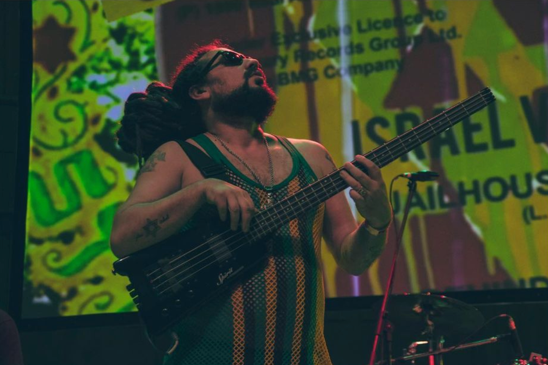



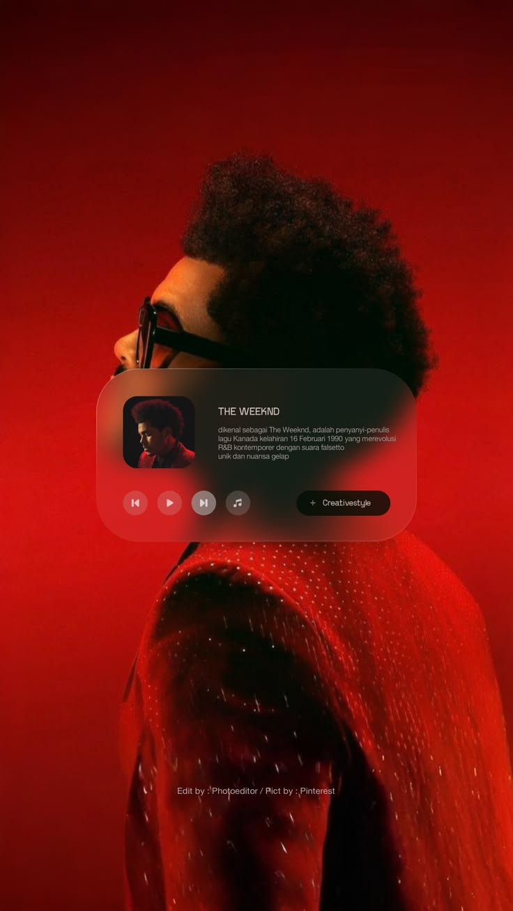
Nine tiles of unequal height, 790 in the pool. Columns: 2 / 3 at 600dp / 4 at 840dp.
Recycled on 3 screens
across 2 flows —
business_profiles/business_gallery, business_profiles/business_reviews_gallery_tab, public_profile/media_gallery.
.ml-masonry .ml-masonry--roomy .ml-mosaic-tile .ml-mosaic-tile__cap .ml-mosaic-tile__pin
The wide tile leads. Everything after it is a beat in the same bar.
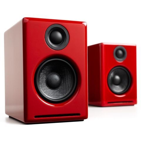
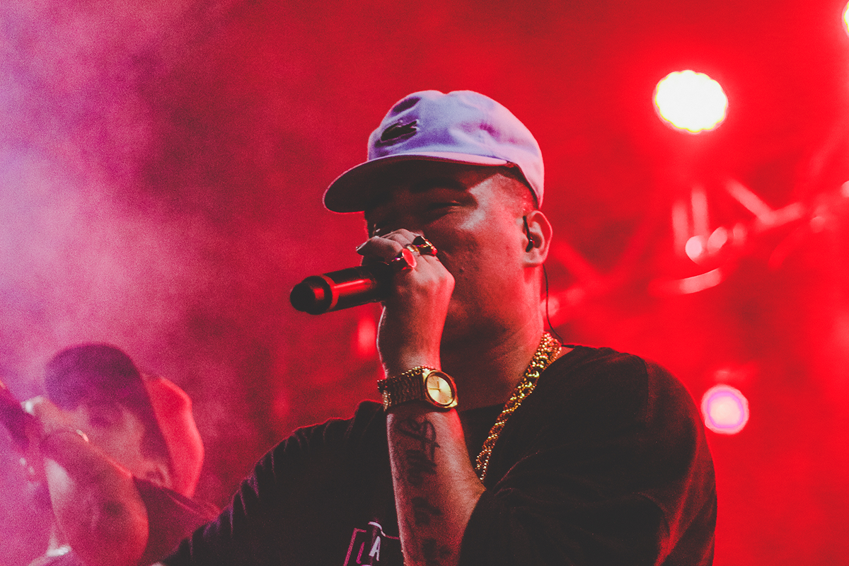
Spans two rows at 600dp and up.
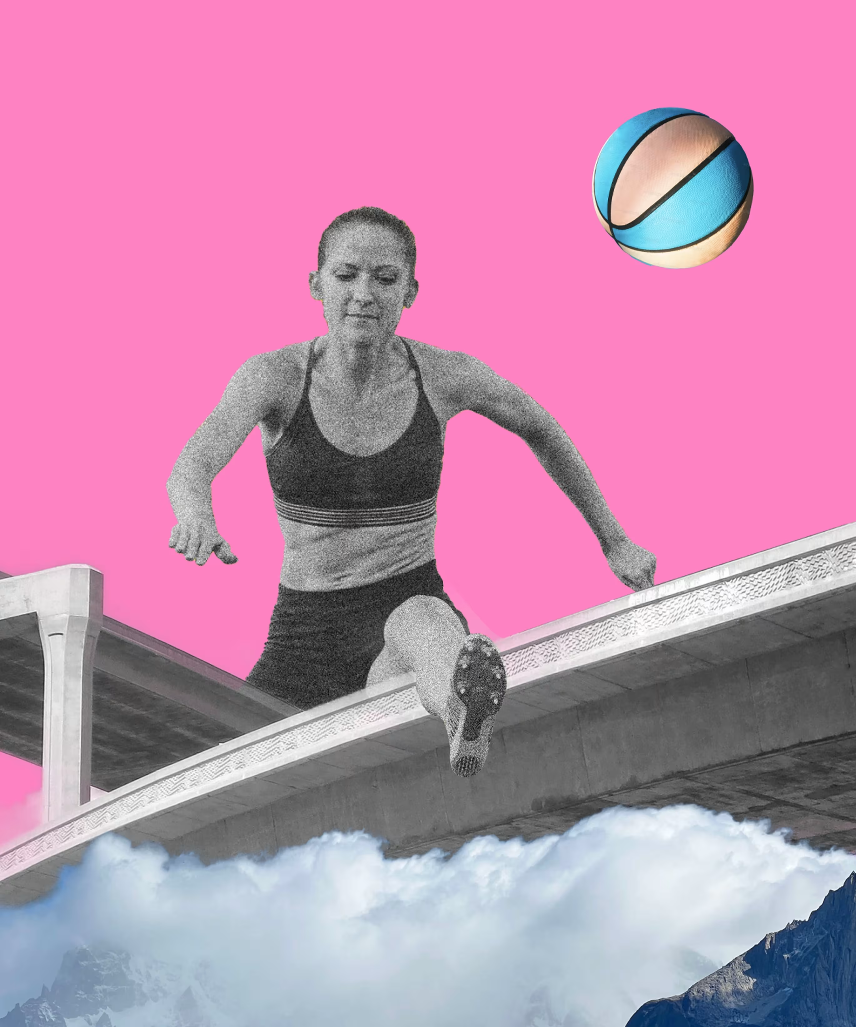
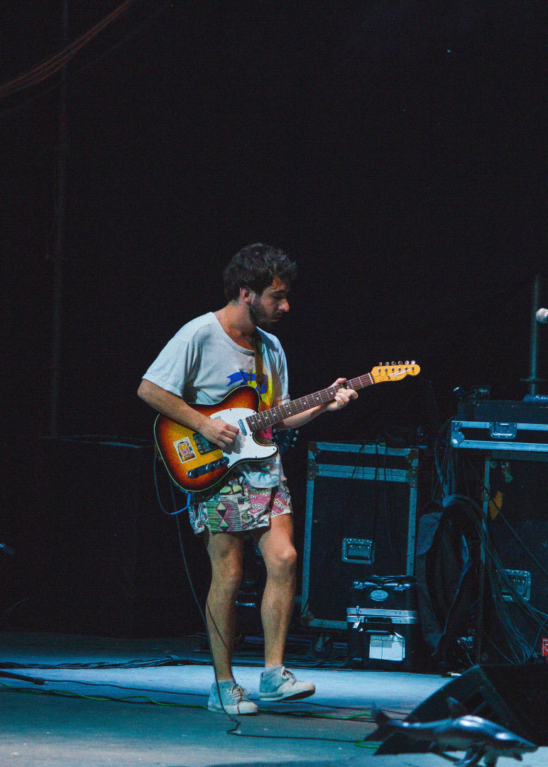
Tiles are translucent white, not a second black — so the same markup works over ink or over media.
5% white fill
12% white border
Both variants carry media in every tile — a bento with empty cells reads as a broken grid, not a considered one.
Not used by any screen yet. Built and documented here; no flow has recycled it.
.ml-bento .ml-bento__card .ml-bento__img .ml-bento__title .ml-bento__body .ml-bento--dark
Find the room, not just the engineer.Ananya Sharma · Playback vocalist, Mumbai
The flipped band puts the media second.Alternating sides is what stops a run of these reading as a slideshow
Not used by any screen yet. Built and documented here; no flow has recycled it.
.ml-split .ml-split__media .ml-quote .ml-quote__citeRecycled on 2 screens
across 1 flow —
cms_pages/blog_changelog, cms_pages/content_home.
.ml-articles .ml-article .ml-article__media .ml-article__tag .ml-article__title .ml-article__metaRestrained on purpose. The palette rule says the chrome is monochrome and the media carries the colour, so these adjust SURFACE, never hue: a frosted panel over media, a soft lift, and a paper grain. No coloured glows.
Surface only — no coloured glows, because the chrome stays monochrome.
Recycled on 6 screens
across 2 flows —
communication/networking_feed_artist_profile, public_profile/public_profile_view, public_profile/public_profile_view_band, public_profile/public_profile_view_business, public_profile/public_profile_view_talent, public_profile/public_profile_view_venue.
.ml-glass .ml-glass--dark .ml-lift .ml-grainDesktop only — a touch screen has no hover. On a phone use Help or a sheet.
Not used by any screen yet. Built and documented here; no flow has recycled it.
.ml-tip .ml-tip--belowNot used by any screen yet. Built and documented here; no flow has recycled it.
.ml-pop-anchor .ml-pop .ml-pop--left .ml-pop__item .ml-pop__item--danger .ml-pop__sep .ml-pop__msg .ml-pop__msg-titleNot used by any screen yet. Built and documented here; no flow has recycled it.
.ml-helpNot used by any screen yet. Built and documented here; no flow has recycled it.
.ml-combo .ml-combo__list .ml-combo__opt .ml-combo__empty .ml-combo__clearNot used by any screen yet. Built and documented here; no flow has recycled it.
.ml-crumbs .ml-crumbs__itemThe recommended tier is marked by border and label, not by colour alone.
Recycled on 2 screens
across 2 flows —
cms_pages/about_pricing_careers, subscription/plans.
.ml-tiers .ml-tier .ml-tier--featured .ml-tier__flag .ml-tier__name .ml-tier__price .ml-tier__unit .ml-tier__feats .ml-tier__feat .ml-tier__feat--offNot used by any screen yet. Built and documented here; no flow has recycled it.
.ml-trends .ml-trends__head .ml-trends__row .ml-trends__rank .ml-trends__term .ml-trends__thumb .ml-trends__label .ml-trends__sub .ml-trends__delta .ml-trends__delta--up .ml-trends__delta--down .ml-trends__delta--flat
Not used by any screen yet. Built and documented here; no flow has recycled it.
.ml-collage .ml-collage__hero .ml-collage__moreProvider marks are the one documented palette exception — their brand terms fix the colours.
Not used by any screen yet. Built and documented here; no flow has recycled it.
.ml-btn--socialNot used by any screen yet. Built and documented here; no flow has recycled it.
.ml-ime-pad .ml-ime-bar .ml-ime-bar__doneBriefs go to the twelve people who actually fit, not the twelve hundred who might.
Every credit is confirmed by a second party before it counts.
Escrow releases when the stems land, not when someone remembers.
Anyone can claim a session. Nothing proves it.
The same fifty DMs to the same fifty inboxes.
Accent disc for capability, neutral disc for problem — a pain point is not an accent.
Recycled on 1 screen
across 1 flow —
cms_pages/marketing_homepage.
.ml-features .ml-feature .ml-feature__icon .ml-feature__title .ml-feature__body .ml-feature--problemThree confirmed credits in a fortnight, and every one of them from someone who found me rather than the other way round.
Recycled on 1 screen
across 1 flow —
public_profile/public_profile_view_talent.
.ml-testimonial .ml-testimonial__quote .ml-testimonial__user .ml-testimonial__name .ml-testimonial__role .ml-testimonial__stats .ml-testimonial__statNot used by any screen yet. Built and documented here; no flow has recycled it.
.ml-album .ml-album__frame .ml-album__play .ml-album__title .ml-album__metaEvery tick names its source. A tick with no source is decoration.
Recycled on 1 screen
across 1 flow —
public_profile/public_profile_view_talent.
.ml-trust .ml-trust__row .ml-trust__mark .ml-trust__what .ml-trust__who .ml-trust__statsNot used by any screen yet. Built and documented here; no flow has recycled it.
.ml-sticker72,000 verified music professionals.
The wall is decorative and aria-hidden; the card carries the meaning. Drift respects prefers-reduced-motion.
Not used by any screen yet. Built and documented here; no flow has recycled it.
.ml-wall .ml-wall__bg .ml-wall__col .ml-wall__col--drift .ml-wall__cardEarns the OS prompt before firing it — Android remembers "don't ask again" after two refusals.
Not used by any screen yet. Built and documented here; no flow has recycled it.
.ml-permission .ml-permission__icon .ml-permission__title .ml-permission__why .ml-permission__actsNot used by any screen yet. Built and documented here; no flow has recycled it.
.ml-capture .ml-capture__optNot used by any screen yet. Built and documented here; no flow has recycled it.
.ml-rec .ml-rec__head .ml-rec__dot .ml-rec__time .ml-rec__meter .ml-rec__bar .ml-rec__actsRecycled on 3 screens
across 3 flows —
communication/collaboration_files, qr_share/qr_scanner, verifications/verification_screen.
.ml-dropzone .ml-dropzone__hint .ml-dropzone__formatsNot used by any screen yet. Built and documented here; no flow has recycled it.
.ml-inline .ml-inline__pencil .ml-inline__actsThe page didn't load. Your data is safe — try again in a moment.
Ref · 8F2C-91ARecycled on 1 screen
across 1 flow —
home/home_dashboard.
.ml-error .ml-error__mark .ml-error__title .ml-error__body .ml-error__refRecycled on 1 screen
across 1 flow —
home/home_dashboard.
.ml-banner--offline .ml-banner--promo .ml-banner__dismissYash Raj Sound Studios · Sat, 4 PM
Not used by any screen yet. Built and documented here; no flow has recycled it.
.ml-success .ml-success__mark .ml-success__ring .ml-success__tickNot used by any screen yet. Built and documented here; no flow has recycled it.
.ml-whatsnew .ml-whatsnew__ver .ml-whatsnew__item .ml-whatsnew__kind .ml-whatsnew__what .ml-whatsnew__why
Dashed line marks the 66.6% safe zone — OEM masks vary and only the centre is guaranteed visible.
Not used by any screen yet. Built and documented here; no flow has recycled it.
.ml-appgrid .ml-appgrid__cell .ml-appgrid__canvas .ml-appgrid__canvas--circle .ml-appgrid__canvas--squircle .ml-appgrid__canvas--rounded .ml-appgrid__safe .ml-appgrid__labelRecycled on 24 screens
across 12 flows —
band/band_create, band/ensemble_lineup, business_profiles/business_overview, business_profiles/business_owner_insights, business_profiles/business_team_tab, communication/ai_matchmaker_tab and 18 more.
.ml-person-rowWidget_Directory: RecommendedCollaboratorCard · AI collaborator matching
The match figure reuses .ml-match rather than a second percentage treatment.
Not used by any screen yet. Built and documented here; no flow has recycled it.
.ml-collab-card .ml-collab-card__head .ml-collab-card__id .ml-collab-card__name .ml-collab-card__role .ml-collab-card__why .ml-collab-card__actionsWidget_Directory: CollaboratorMatchWidget · a rail OF the card above
Layout only — it does not restyle the cards it holds, so the two cannot drift.
Not used by any screen yet. Built and documented here; no flow has recycled it.
.ml-collab-railWidget_Directory: DiscoverySearchResultCard · global search result item
The richer sibling of .ml-result — a row has no room for genres or match data.
Not used by any screen yet. Built and documented here; no flow has recycled it.
.ml-search-result .ml-search-result__body .ml-search-result__name .ml-search-result__meta .ml-search-result__tagsWidget_Directory: NetworkingFeed · social activity feed
Tracked three takes of the bridge today. The room finally sounds right.
Looking for a tabla player for a session in Bandra next week.
You're all caught up
The post is .ml-post. This is the feed around it — it owns the two states a post has no concept of, loading-more and empty.
Not used by any screen yet. Built and documented here; no flow has recycled it.
.ml-feed .ml-feed__endWidget_Directory: BandMembersWidget · roster with instrument roles
Not used by any screen yet. Built and documented here; no flow has recycled it.
.ml-roster .ml-roster__member .ml-roster__id .ml-roster__name .ml-roster__instrumentWidget_Directory: StudioVenueListItem · compact StudioCard
A modifier on .ml-studio-card, not a second block — same data, one-line layout.
Not used by any screen yet. Built and documented here; no flow has recycled it.
.ml-studio-card--compactWidget_Directory: FeaturedStudioCard · hero studio promotion
Not used by any screen yet. Built and documented here; no flow has recycled it.
.ml-featured-studio .ml-featured-studio__body .ml-featured-studio__name .ml-featured-studio__meta .ml-featured-studio__rateWidget_Directory: StudioSpecWidget · console, monitors, mic inventory
Not used by any screen yet. Built and documented here; no flow has recycled it.
.ml-spec .ml-spec__row .ml-spec__key .ml-spec__valWidget_Directory: ProjectCard · portfolio release presentation
Not used by any screen yet. Built and documented here; no flow has recycled it.
.ml-project-card .ml-project-card__body .ml-project-card__title .ml-project-card__meta .ml-project-card__creditsWidget_Directory: RecentProjectCard · compact dashboard ProjectCard
Not used by any screen yet. Built and documented here; no flow has recycled it.
.ml-project-card--compactWidget_Directory: TrackCard · track release discovery item
Platforms are named in the existing badge — the system ships no third-party logo artwork.
Not used by any screen yet. Built and documented here; no flow has recycled it.
.ml-track .ml-track__body .ml-track__title .ml-track__meta .ml-track__platforms .ml-track__playsWidget_Directory: AudioPodcastDemoWidget · inline demo player
A modifier on .ml-player, not a second player — the transport and waveform are the same component.
Not used by any screen yet. Built and documented here; no flow has recycled it.
.ml-player--inline .ml-player__titleWidget_Directory: HireContactModal · hiring inquiry
Form body only. The shell is .ml-sheet or .ml-dialog, so this cannot fork their open/close behaviour.
Not used by any screen yet. Built and documented here; no flow has recycled it.
.ml-hire .ml-hire__scope .ml-hire__row .ml-hire__label .ml-hire__budgetWidget_Directory: WhatsAppShareSheet · external share with preview
Check out Ananya on MusicLinkd — musiclinkd.com/ananya
Named for the job, not the destination — a .ml-whatsapp-sheet guarantees a near-identical .ml-telegram-sheet later.
Recycled on 9 screens
across 5 flows —
business_profiles/create_business, marketplace/marketplace_create_listing, profile_management/band_profile_editor, profile_management/business_profile_editor, profile_management/talent_profile_editor, profile_management/venue_profile_editor and 3 more.
.ml-share .ml-share__preview .ml-share__msg .ml-share__channels .ml-mosaic-tile__pin .ml-mixer__mute .ml-banner__dismiss .ml-upload-grid__remove .ml-upload-grid__add .ml-market-card__saveUse purposeful motion only: pressed state, gentle card lift, sheet/modal fade and scale, swipeable discovery, audio waveform feedback, and skeleton loading. Respect reduced-motion preferences.
Reconciled 2026-08-31. This file predates the v9 system and several of its values had gone stale. Corrections are marked below; the rules that survived are unchanged. It is now rendered into /guide by scripts/build-guide.mjs, so this file is the source and cannot drift from the catalogue again.
Web durations are the four --duration-* tokens. Native does not take a duration — it takes a spring, and MLMotion.spring1..4 are emitted to both Compose and SwiftUI from the same source.
| Token | Web | Usage |
|---|---|---|
--duration-1 | 125ms | Button press, chip toggle, ripple |
--duration-2 | 200ms | Hover, icon change, colour change, dismissal |
--duration-3 | 320ms | Sheet reveal, card lift, shared-element transform |
--duration-4 | 500ms | Modal fade+scale, splash |
Was 150/200/300/500. Three of the four disagreed with the shipped tokens.
--ease-standard for most motion, --ease-enter for arrivals, --ease-spring for overshoot. Was “use one easing curve for all motion”. A single curve cannot express arrival and departure, and native uses springs regardless.scale(0.97). (unchanged — matches .ml-btn:active)prefers-reduced-motion.The system has feedback motion but no choreography: 0 entry animations, 0 view transitions, 0 scroll-driven motion, and state switching is a hard cut across 518 states. See docs/09-Roadmap/motion-plan.md.
Four steps, dual-authored. Web gets a duration and a cubic-bezier; native gets spring physics, because a duration is not translatable to a spring and pretending otherwise was the web-shaped assumption in the old system. Press Play to run each one.
125ms cubic-bezier(0.4, 0, 0.2, 1) ·
android spring(1, 1500) ·
iOS response 0.15
200ms cubic-bezier(0.4, 0, 0.2, 1) ·
android spring(0.9, 700) ·
iOS response 0.25
320ms cubic-bezier(0.05, 0.7, 0.1, 1) ·
android spring(0.85, 400) ·
iOS response 0.35
500ms cubic-bezier(0, 0.35, 0, 1.25) ·
android spring(0.75, 300) ·
iOS response 0.5
Every animation in the system is disabled under prefers-reduced-motion,
which Android reads as ANIMATOR_DURATION_SCALE.
Canonical layout families. A new page should start from one of these templates.
Reconciled 2026-08-31. Rendered into /guide by scripts/build-guide.mjs, so this file is the source and cannot drift from the catalogue. Its interactive reference used to be styleguide.html, which now 301-redirects to /guide.
The nine families below predate the flow model. /guide → Patterns is the live list — 24 flows generated from webapp/flows/. These remain the layout archetypes those flows are built from.
| Template | Purpose | Key sections |
|---|---|---|
| Splash | App launch | Centered logo on dark background, fade-in |
| Login | Authentication | Email/password, social auth, brand mark |
| Onboarding | Profile setup | Progress indicator, role selection, photo upload, genre/skills, availability |
| Home | Personalized dashboard | Greeting, quick stats, activity feed, recommendations, upcoming bookings |
| Discover | Card-driven discovery | Search bar, filter chips, card grid, skeleton loading, empty state |
| Artist Profile | Talent showcase | Hero, About, Audio, Projects, Credits, Reviews, Gallery, Services, sticky Hire CTA |
| Studio Profile | Business showcase | Identity header, equipment, rooms, calendar, reviews, Booking CTA |
| Marketplace | Gear & instrument listings | Category tabs, search, filter bar, listing grid, sorting |
| Settings | Account management | Profile, Account, Notifications, Privacy, Payments, Help, Log out |
tokens/tokens.json for all spacing, radius, color, and motion values.Use shared modules — identity, hero, audio, projects, credits, gallery, services, equipment, availability, reviews, contact, and business information — to compose profiles. Do not create a wholly separate layout for every role.
Reconciled 2026-08-31. Rendered into /guide by scripts/build-guide.mjs, so this file is the source and cannot drift from the catalogue. Its interactive reference used to be styleguide.html, which now 301-redirects to /guide.
Still unbuilt in the design layer. role_profiles is a live Firestore collection with an admin route, and none of the four families or their module lists appear in /guide. This file is currently the only place the composition rules exist — see the Gaps ledger, "Live data the design layer cannot see".
| Family | Roles | Key modules |
|---|---|---|
| Talent | Singer, Instrumentalist, Producer/Engineer, DJ/Performer, Composer, Lyricist | Hero + photo capture, verification badge, nav tabs (About, Projects, Credits, Reviews), audio waveform, Connect/Hire CTA |
| Band | Ensembles, groups, duos | Banner + logo, lineup carousel (member cards), technical rider & stage plot, media reel, Booking CTA |
| Business | Recording Studio, Record Label, Music School, Equipment Dealer | Identity header, equipment checklist, room photos, availability calendar, reviews, Booking CTA (studio) / Course catalog (school) / Artist grid (label) / Product catalog (dealer) |
| Venue | Concert hall, club, amphitheater, festival | Hero imagery + address, capacity & features ledger, event calendar, Booking CTA for tour managers |
| Role variant | Modules |
|---|---|
| Singer / Vocalist | Vocal register, performance languages, microphone specs |
| Instrumentalist | Core instrument registry, touring setup, session availability |
| Producer / Engineer | DAW stack, outboard gear ledger, A/B mixing deck |
| DJ / Performer | Deck setup, residency timeline, festival logs |
| Composer | Filmography, original scores carousel |
| Lyricist | Signature lyric cards, IPRS verification, writing languages |
tokens/tokens.json for all spacing, radius, color, and typography values.components/README.md).
Composed patterns are real screens, not mockups — every one below is
live under /preview and built from the components above. Listed
straight from the repo, so this cannot drift the way the old block list did
(it claimed 84 against an actual 94).
From pinterest/gestalt (Apache-2.0), extracted to SVG. Gestalt is
reference only — no Gestalt code ships. Screens inline these at build
time via icon(), which fails the run on an unknown name rather
than rendering an empty box.
Two optical grids. 25 "compact" icons are drawn on a 16-unit box and 398 standard icons on 24. Rendering a 16-unit glyph at 22px inflates its strokes about 1.4x against a 24-unit one beside it — which is what made the set look unstable. Each is now shown at its own native size.
Restored 2026-08-31 on the brand owner's
instruction. styleguide.html had specified “Lucide icons, 1.75px stroke”
and the v9 rebuild replaced it wholesale with Gestalt; both now ship.
Vendored from lucide-react@1.28.0 (ISC) — the package was
already an admin dependency, so this is extracted from the installed copy
rather than fetched, and the build fails if any icon does not parse.
Never mix the two inside one control or one toolbar. Gestalt is
filled, Lucide is a 2px stroked outline; at the same size a filled glyph
beside a stroked one reads as two different weights — the same instability
the 16-vs-24 grid fix removed. Choose a set per surface. Gestalt stays the
product set because screens inline it at build time; reach for Lucide when
the product set has no glyph for something.
These render via CSS mask rather than inline SVG, so the grid
costs ~4KB of markup instead of 680KB and each glyph still takes its colour
from currentColor.
The product vocabulary — 89 values
across 18 categories, generated from
Master_Data_Seed_Values.md, which is canonical and
Firestore-backed. These are the words the UI is allowed to use.
vocal_rangedaw_toolssession_typessession_duration_tiersstudio_servicessinging_styleslyricist_specializationsdirector_specializationscomposition_stylesengineer_specialtiesdj_typesverification_id_typeavailability_statuspodcast_categoriesmarketplace_categoriesequipment_categoriesbudget_typeopportunity_typesComputed from the repo, not listed by hand. The old registry was hand-maintained and went stale; this one cannot.
Named in Widget_Directory.md with no matching component in the system.
Still carrying local <style> blocks or pre-system markup.
205 of
205 screens are rebuilt.
Documented here, used by no screen. Not a rendering fault — this is the recycling backlog, and it is the number that should fall as flows are rebuilt. Each component page states its own count.
Loading is declared by 4 screens and rendered by 26. A screen that promises a loading state and shows nothing is worse than one that never claimed it — the component state map above already predicts this by listing Loading as composed rather than owned, and almost nothing composes it.
Firestore collections with full admin CRUD and no counterpart in this catalogue. A screen author cannot tell which persona a screen serves or which module it belongs to, because neither is expressed anywhere in the design layer.
| Missing here | Exists as |
|---|---|
| Personas / roles | admin route /role-profiles + Firestore collection |
| Platform modules | admin route /modules + Firestore collection |
| Analytics | admin route /analytics + Firestore collection |
4 sections exist in the CSS with no demo on this page. Listed rather than hidden:
state transitions — ml-core.css, 0 selectorsscreen transitions — ml-core.css, 0 selectorsentry choreography — ml-widgets.css, 5 selectorsscroll-driven reveal — ml-widgets.css, 0 selectors
Replaces /guide/styleguide (213 tokens) and
/guide/musiclinkd-system (524 Gestalt tokens). Both 301-redirect
here via firebase.json, verified live 2026-08-31. Generated by
scripts/build-guide.mjs — do not hand-edit.